Responsive Web Design: Case Study

In 2013 design and the user experience has changed a lot.
While SEO continues to be a buzz word that many webmasters chase, they are failing to see what is happening in terms of changes for not only SEO but also for design and conversion and how all of these relate to each other.
This article is more of a case study as I am working on the website for F1-bettings.com and making changes to adjust for some feedback.
After gaining some experience in knowing how players are converting on the content, the new designs are reflected in knowing what the users might be interested in based on what they searched for or how they arrived to the website.
The #1 reason for changing the website design was mainly due to the amount of traffic coming to the site from mobile phones.
F1-bettings.com is a sportsbetting website focused on Formula 1.
The nature of sports related sites is they get plenty of mobile traffic.
F1-bettings.com is getting over 35% of the traffic from mobile sites with about 26% of traffic on iPhone devices, 10% on Android and the rest on Blackberry and Windows Mobile.
Talking to other webmasters with websites based on sportsbetting, they seem to have a lot of mobile traffic and this is traffic not only should you convert but ensure they don’t leave if they arrive on your site and they can’t read or navigate it.
F1-bettings
% of traffic from mobile: 36%
% of traffic from iOS 26%
% of traffic from Android 10%
betnhl.ca
% of traffic from mobile: 36%
% of traffic from iOS 25%
% of traffic from Android 10%
% of traffic from mobile: 25%
% of traffic from iOS 17%
% of traffic from Android 7%
This data is from the past month for March 2013 and for those blackberry fans, sadly they didn’t even crack the 1% mark. Windows mobile had less traffic as well.
On F1-bettings.com the mobile visitors spend less time on the site and the bounce rate was higher.
Mobile traffic interested in a topic for sportsbetting should be in theory an easier one to convert and is also valuable.
To allow these users to leave the site is enough to consider a redesign of the site primarily to create a responsive design but as well to ensure that regular viewers on their computers are also converting better.
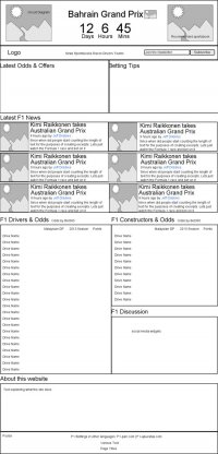
So in any redesign process I like to start by first making notes about what is important for each page as well as having a good navigation, then by mapping out the content, followed by creating a wireframe of the site before finally creating the design as PSD files which can then be converted to html/php or any CMS like wordpress.
My tools for the content mapping and wireframing are xmind for creating the sitemap and moqups.com for creating the wireframe.

In this case the mapping of content wasn’t necessary as much as trying to understand what is important to the user on the site.
What does seem very important and relevant to any fan of Formula 1 racing is information on when the next race is happening.
If they are interested in betting then the design has been setup such that to give the user one main choice for a sportsbook.
Many sportsbook affiliates tend to work with a smaller number of programs so it is all about keeping it simple and making the choice for the user an easier one.
If you are an affiliate focusing on sportsbetting, your job is to see which programs convert for you and which programs have good feedback showing your stats.
The homepage the order of items starts with the race information and a recommended sportsbook, followed by the latest betting odds and tips.
Then the most recent news, followed by data on all the races, drivers standings, constructors’ standings as well as the latest odds.

The next pages that are important for layout are the driver review pages and the listings pages.
The listings pages can be used dynamically whether to list sportsbooks, racetracks or drivers.
The design features a grid system to present the content in an easy to scan way.
Responsive Design
If this word is new to you, here is a quick explanation of what is responsive design.
Simply put, you can have your website mobile friendly using a responsive design that automatically adjusts based on your screensize.
An easy way to test if a website has responsive design is to just shrink your browser size and see if you can still read the content or not.
If you have seen mobile versions of website in the format of say m.website.com this is in theory not the best for SEO practices so the design community in 2013 is buzzing over responsive design as the go to standard for getting your website formatted for mobile.
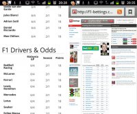
Attached is a screenshot of the section of the page on an Android phone.

Conclusion
The new F1-bettings website is being launched at the time of writing this article.
Expectations for this new design are to have better conversion for both regular computer users but more importantly to capture and convert the mobile traffic.
So if you have a sportsbetting website, first thing you should do is check what percentage of your traffic is visiting your site from a mobile device and then compare the bounce rates.
If your traffic has 20% or higher of mobile users, then check your bounce rates, if they are higher than regular computer visitors then you need to get up to date with the latest standards in design and consider getting your website converted for responsive design so it is readable and functional on any device like a tablet, ipad, iphone, android or for those that might be using a blackberry but refuse to let go.
If you are in need of a new design for your portal or need help getting your site converted to responsive design I can help.

 John Wright


